Screen template wizard
Set up the bars above and below all screens (logo, project name, user, date / time, alarms, command buttons, screen navigation) in five steps; the Status Info, Navigation Bar, Command Buttons and Alarm Bar objects used by the wizard.
In Live the operator sees the same header and footer on every screen: company logo, project name, logged-on user, date / time, latest alarm, alarm acknowledge button and buttons for switching between screens. The screen template wizard builds these bars in five steps: it creates the bar screens, places the objects, defines the navigation menu and links the bars to the fixed top / bottom area of Screen management. The result is ordinary screens and objects; they can also be changed manually in the editor afterwards.
Opening the wizard
- Tools›Screen template wizard…
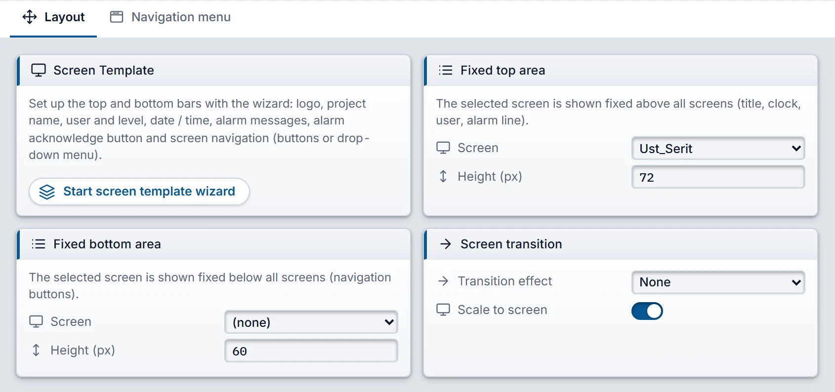
- In the project tree, Screen management › Layout tab › Screen Template card: the Start screen template wizard button. Once the template is set up, the card shows Template installed and the button is renamed Open template wizard.
 12345
- Screen Template — starts the wizard; if a template is installed, it also shows its status.
- Fixed top area — the screen that stays above all screens.
- Height — height of the area in pixels (0 – 600).
- Transition effect — None, Fade, Slide.
- Scale to screen
The five steps are on the left of the window, and a live preview of the bars is at the bottom. The preview is drawn with the Studio drawing engine and is refreshed with every selection. If space is tight, a yellow warning appears in the bottom bar. Navigate with Next › and ‹ Back or by clicking a step on the left. Cancel, × or Esc first asks “Close without applying your selections?”; if you close, nothing changes in the project.
Five steps
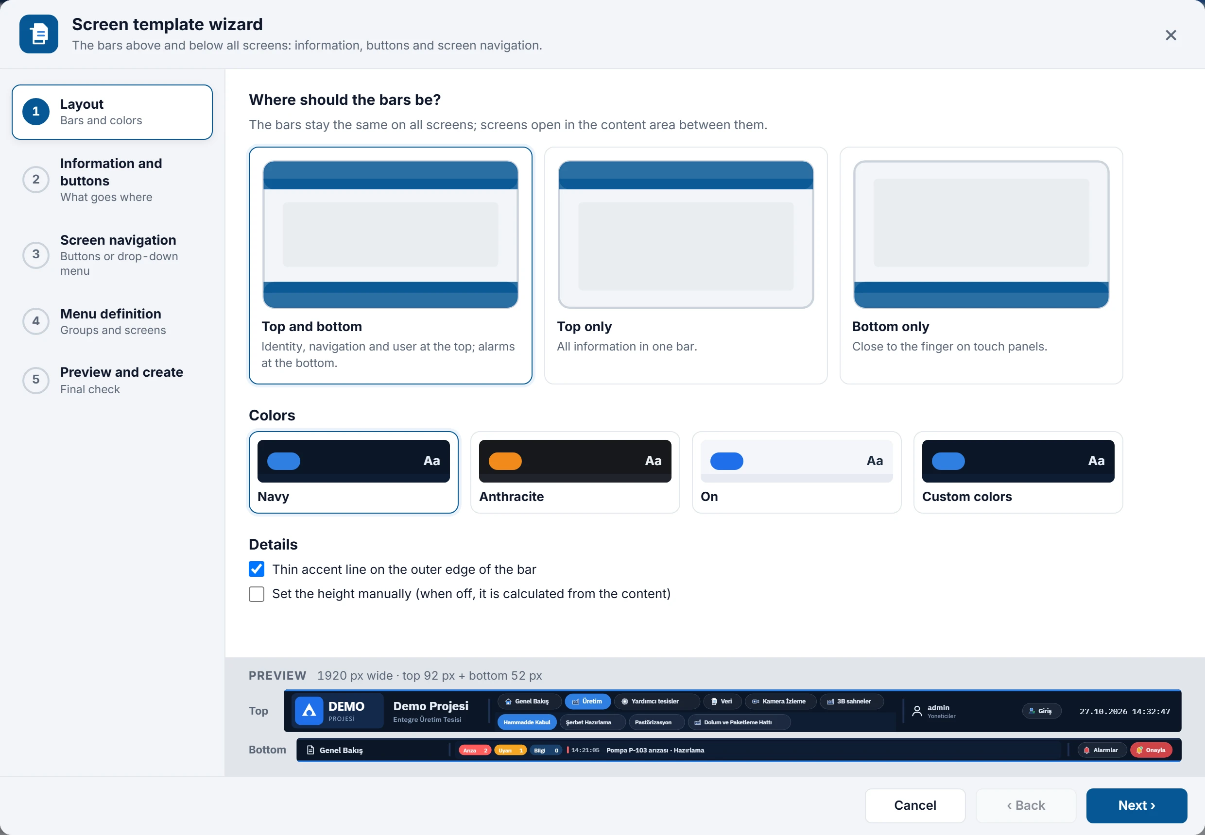
- Layout: bars and colors
Select the position of the bars: Top and bottom, Top only or Bottom only (close to the finger on a touch panel). The Colors section offers three ready-made sets (Navy, Anthracite, Light) or Custom colors; in the custom set you choose the colors for the background, second background, text, dimmed text, accent (selected button) and separator line one by one. Details: a thin accent line on the outer edge of the bar and Set the height manually (32 – 300 px). If the height is not set manually, it is calculated from the content (for example, a top bar with two-row navigation is 92 px, a bottom bar 52 px).
 12345
Step 1: position of the bars and color set; below, a preview of the two bars. - Steps — five steps; click a completed step to go back to it.
- Bar position — top and bottom, top only, bottom only.
- Colors — three predefined sets or custom colors.
- Preview — the bars are redrawn after every change.
- Bottom bar — a warning if space is tight; Back, Next and, in the last step, Create.
- Information and buttons
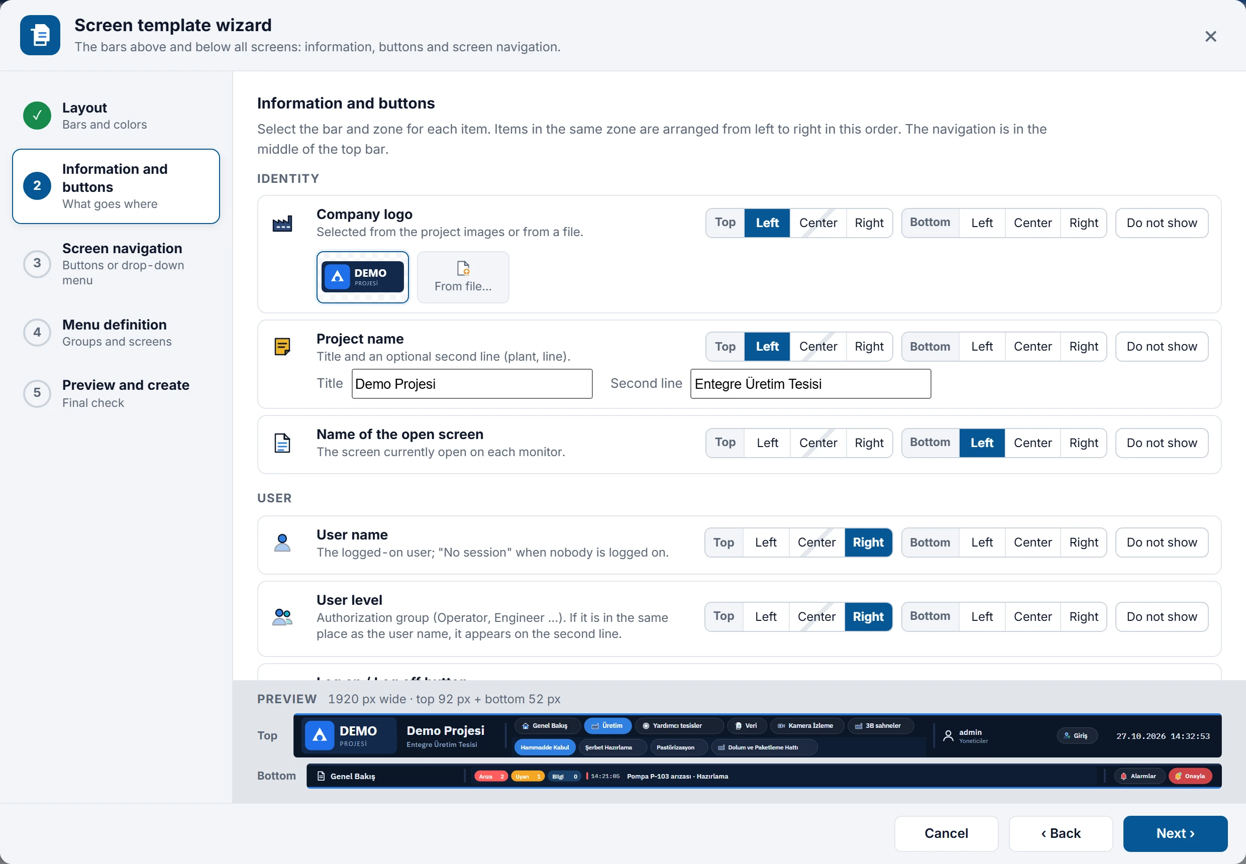
For each item select the bar and the zone: Top / Bottom × Left / Center / Right. Do not show removes the item. Items in the same zone are arranged from left to right in the order of the list. The navigation sits in the middle of the bar you selected; the Center button of that bar appears hatched (the item is placed next to the navigation). The items and their settings are listed in the table below.
 12
Step 2: position of the items in the Identity and User groups; the logo was selected from the project images, and a second line was added to the project name. - Position selector — Top / Bottom bar × Left / Center / Right; Do not show removes the item.
- Logo — from the project images or from a file.
- Screen navigation
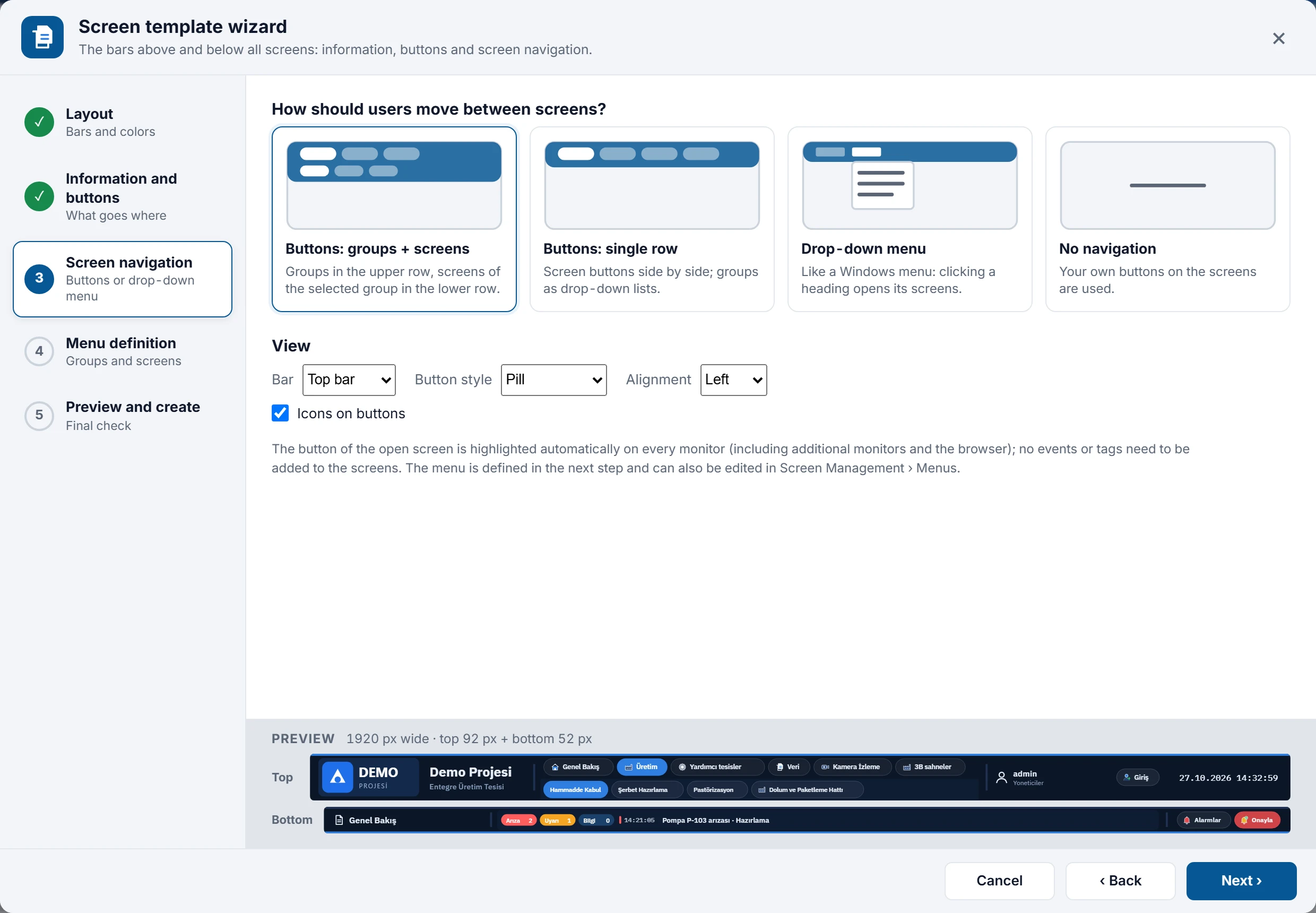
Select how the operator switches between screens: Buttons: groups + screens (groups in the top row, screens of the selected group in the bottom row), Buttons: single row (the groups become a drop-down list), Drop-down menu (like a Windows menu) or No navigation (your own buttons on the screens are used). In the Appearance section, select the bar (top / bottom), Button style (Pill, Tab, Underline, Block (touch)), Alignment and Icons on buttons. The button of the open screen is highlighted automatically in Live; you do not need to add events or tags to the screens.
 12
Step 3: the four navigation types and the appearance of the buttons. - Navigation type — two rows of buttons, one row of buttons, drop-down menu or none.
- Appearance — bar, button style, alignment, icon.
- Menu definition
The navigation buttons or the drop-down menu are drawn from a menu. In this step you edit the groups and screens of the menu (if No navigation was selected, the step is skipped). Details below: Menu definition.
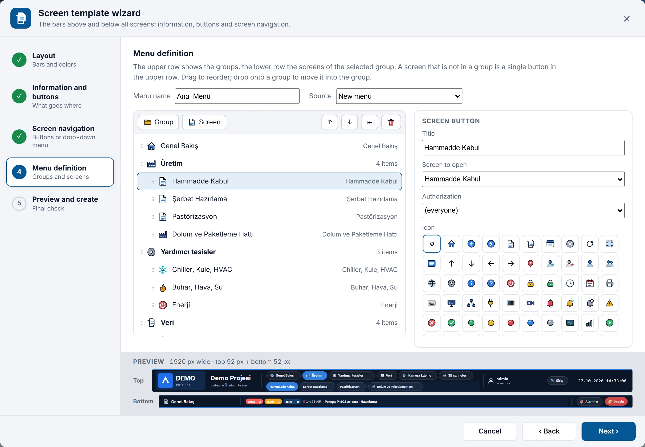 1234
Step 4: the menu suggested from the screen groups; the title, target screen, authorization and icon of the selected screen button on the right. - Menu name and source — new menu, existing menu or refilling from the screens.
- Tools — Group, Screen, up / down, remove from group, delete.
- Menu tree — drag to sort; an item dropped onto a group joins that group.
- Selected item — title, screen to open, authorization, icon.
- Preview and create
The whole display (bars + the content area between them) is previewed. The Changes list tells which screens will be created or rebuilt, the state of the menu and whether the alarm line at the bottom of the Live display will be switched on or off; any Warnings and Notes are listed as well. The Content area section shows the size left for the screens after the bars. Screens of a different size are fitted in Live with their aspect ratio kept; if you wish, the Set the height of … screens to … px (objects are not moved) box makes the height of the screen-wide 2D screens equal to the content area. Click Create.
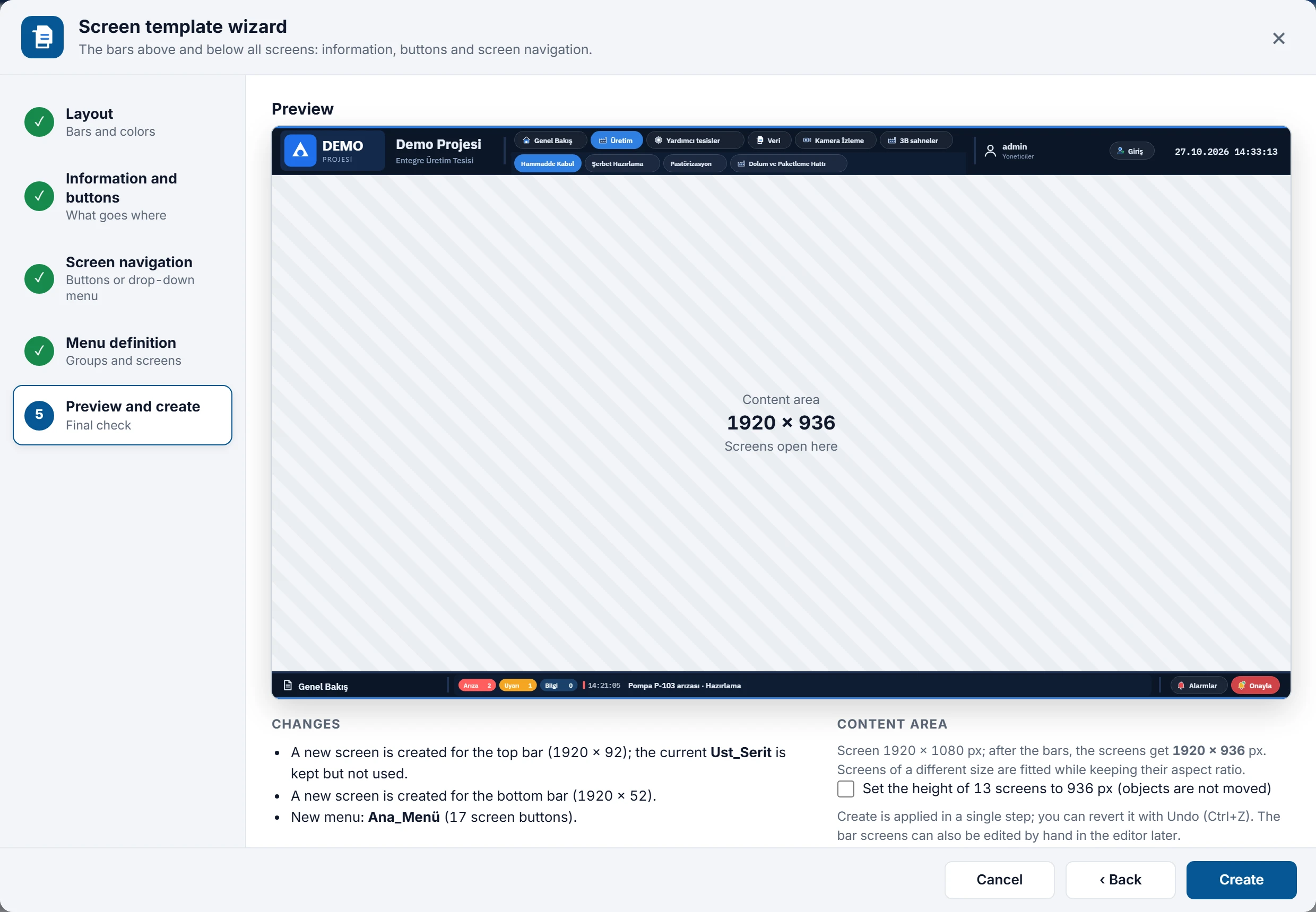 1234
Step 5: new top and bottom bars and a new menu in Demo_Projesi; the old Ust_Seritscreen is kept.- Screen preview — the bars and the content area between them.
- Changes — screens to be created, menu, alarm line.
- Content area — the size left for the screens; screen heights can be adjusted if required.
- Create — applies everything as a single undo step.
Items of step 2
| Group | Item | Setting and note |
|---|---|---|
| Identity | Company logo | Selected from the project graphics or loaded with From file… (PNG, JPEG, SVG, GIF, WebP, BMP; max. 3 MB). A graphic selected from a file is added to the project graphics with Create. If no logo is selected, an empty graphic frame remains in its place. |
| Project name | Title (default: the project name) and an optional Second line (plant, line). | |
| Name of the open screen | The display name of the screen currently open on each display. | |
| User | User name | The logged-on user; No session when no one is logged on. |
| User level | The user's group (the group name in User administration). If it is in the same zone as the user name, it sits on the line below. | |
| Log on / Log off button | Opens the log-on window when no one is logged on, and logs off when a session is open. | |
| Alarm | Alarm messages | The counters of the alarm classes and the last alarm; clicking opens the alarm window. This item has one more position: if Screen bottom is selected, no alarms are placed in the bar, and Live's own alarm line at the very bottom of the screen is used. |
| Alarm acknowledge button | Acknowledges all pending alarms. Flashes in the warning color while there are alarms awaiting acknowledgement. | |
| Alarm list button | Opens the alarm window. | |
| System | Date and time | Display: Date and time, Time only, Date only. |
| Home screen button | Opens the start screen. | |
| Back button | Returns to the previous screen. | |
| Language button | Switches to the next project language. If the project has only one language, the button is not visible in Live (the wizard notes this). | |
| Light / dark theme button | Changes the Live theme. | |
| Print button | Prints the open screen. | |
| System menu button | Opens Live's system menu on the right. | |
| Close program button | Closes Live (Live's closing rules and authorization apply). |
Button appearance at the bottom of the page applies to all command buttons: Display (Icon + text, Icon only, Icon above, text below) and Style (Pill, Square, Plain (no background)). Buttons in the same zone become a single Command Buttons object. Default layout: logo and project name top left; user, level, log-on button and clock top right; name of the open screen bottom left, alarm messages bottom center, alarm buttons bottom right. If you set the layout to Top only or Bottom only, the items of the removed bar are moved to the same zone of the remaining bar.
Menu definition
- Menu name: default
Ana_Menü. The name is adapted to the rule of the Menus table: only letters, digits and_remain (other characters become_),Menu_is prefixed if the name does not start with a letter, and_2,_3… is appended if a menu with the same name exists. - Source: New menu (or the menu the wizard set up earlier), Existing menu: … (edits a menu of the project) or refilling from the screens: Rebuild from screens: by folder (the screen groups in the project tree become menu groups; screens that are not in a group are single buttons at the top), Rebuild from screens: without groups, Rebuild from screens: single group. Refilling deletes the order and names you set manually; confirmation is requested first. If the project has a menu, the wizard suggests the first menu when it opens for the first time.
- Tools: Group, Screen, up / down, remove from group (⇤) and delete. Drag the rows to sort them; a row dropped onto the middle of a group joins that group. Groups have a single level: a group cannot be placed inside another group.
- Screens not in the menu: appear as buttons below the list; clicking one adds it to the menu. 2D screens and 3D scenes can be placed in the menu; faceplate, template, design and bar screens, and screens with Show in Live turned off, are not listed.
- Selected item: Title, Screen to open, Authorization ((everyone) or an authorization; for a user without it, the button appears faded and cannot be clicked) and Icon. When a screen is selected, the title and icon are suggested from the screen name. Items that run another function in the Menus section (for example Acknowledge alarms) appear as command and remain unchanged.
- Check: the menu must contain at least one screen, and the target screen must be selected for every screen button; otherwise Next › and Create display a warning.
The menu is written to the Menus list of the project; it can also be edited later in the Menus and toolbars section. When the wizard is opened again, the menu is read from there.
What happens when you click Create
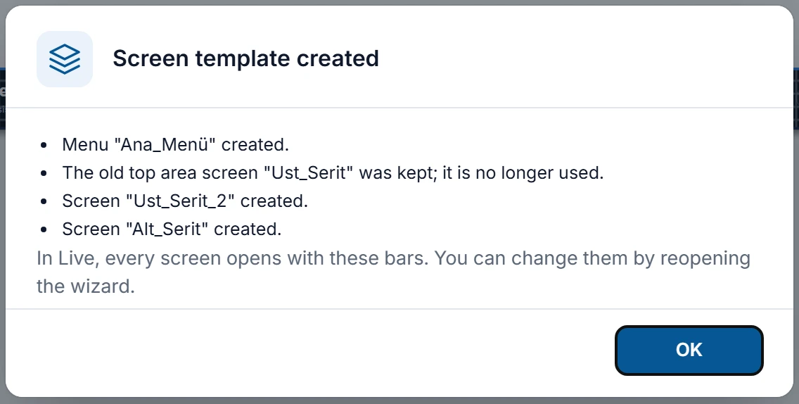
- A 2D screen is created for each bar:
Ust_SeritandAlt_Serit(Ust_Serit_2… if the name is already used), with the display name Top Bar / Bottom Bar, the display width as width and the bar height as height. The screens are entered with their heights in the Fixed top area / Fixed top area fields of Fixed bottom area. - If navigation was selected, the menu is created or updated.
- If Alarm messages is selected for Screen bottom, the Show alarm line setting of Live is turned on; with the other choices (in a bar or Do not show) it is turned off, so the alarm does not appear in two places (Live settings).
- If you selected this option, the height of 2D screens as wide as the display is set equal to the content area; objects are not moved.
- The whole change is a single undo step: Ctrl+Z undoes the entire template. The first bar screen opens in the editor and a summary of what was done is shown.
- Your selections are stored in the project; when the wizard is opened again, it starts with these selections.
 12345
- Image — company logo.
- Text — the project name (and its second line).
- Navigation Bar — groups in the top row, the screens of the selected group in the bottom row.
- Status Info — user name and level.
- Clock — date and time.
 12
- Status Info — the name of the open screen.
- Alarm Bar — class counters and the latest alarm (sample values in Studio).
Running the wizard again
- The bar screen created by the wizard is rebuilt from scratch with every Create (the screen ID stays the same). Manual changes you made on this screen are lost; the summary step points this out.
- If a screen has already been selected manually for the fixed area (for example
Ust_Seritin the Demo Project), the wizard does not touch it: a new bar screen is created, the fixed area switches to the new screen, and the old screen remains unused in the project. Delete it later if you wish. - If you remove a bar (for example by switching to Top only), that fixed area is turned off; its screen is not deleted.
Template objects
The wizard builds the bars from graphic, text, clock and rectangle objects plus four new controls. These objects are in the Controls group of the toolbox; they can also be placed manually on any 2D screen (Controls). They are not available in 3D scenes. In Studio they are drawn with sample values from the project data (first user, first screen, sample alarm); in Live they show the real values.
- Status Info
- Shows: User name, User name and level (two lines), User level (group), Name of the open screen, Project name or Computer name. Other properties: Prefix text (written in front of the value, for example
Kullanıcı:), When no one is logged on (default No session), Icon, font size, color and weight, Level color, Horizontal alignment (when the icon is off), background, border and corner. The value is refreshed when a user logs on / off and when the screen or the language changes. Each display (Live window, additional monitor, browser) shows its own open screen. - Navigation Bar
- Shows a menu (Menu property; Screen management › Menus and toolbars › Menus) as buttons. Layout: Single row (submenus as drop-down lists) or Two rows (groups + screens). Appearance: Button style, Alignment, Show icons, Equal width, font size (9 – 32) and color, Selected button color, Selected button text, Second row background. In Live, the button and the group of the open screen are highlighted automatically on every monitor. With two rows, clicking a group selects the group; if the open screen is not in that group, the first screen of the group opens. When a screen that is not linked to a group is opened, the group highlight is removed. A click applies the function list and the authorization rule of the menu item unchanged; an item without authorization is dimmed and inactive.
- Command Buttons
- In the Buttons group, the commands that are turned on are arranged in a fixed order: Home screen, Back, Alarms, Acknowledge, Input / Output, Language, Theme, Print, Menu, Close (on a new object, Alarms, Acknowledge and Log on / Log off are on). Appearance: Display, Button style, Alignment, font size and color, Unacknowledged alarm color. While an alarm is waiting for acknowledgment, Alarms and Acknowledge flash in this color. While a session is open, the Log on button becomes Log off. The commands work with the same rules as the functions in object events (authorization, remote monitoring / control).
- Alarm Bar
- Display: Counters + latest alarm, Latest alarm only or Counters only. The counters are the number of alarms in the list for the first four alarm classes; the latest alarm is written with time, number, text and fault location. When there is no active alarm, it shows No active alarms. If Alarm window on click is on, clicking the bar opens the alarm window. Also font size and color, background color and corner radius.
Navigation buttons that do not fit: “⋯”
If not all buttons fit on the Navigation Bar, those that do not fit go into the ⋯ button at the end of the row. When the operator clicks ⋯, the hidden buttons open in a list; if the open screen is in this list, the ⋯ button is highlighted. If there is no room below, the list opens upwards. The calculation is repeated when the object or window size changes. The wizard also reports this in advance: a warning if the top row (groups) does not fit, an information note if only the screens of some groups do not fit on a single row.
Limitations and points to note
- Template objects are used only on 2D screens. The fixed area is not shown on a TV display; on a TV these objects cannot be clicked.
- Bar screens are ordinary screens: you can change them in the editor, but when the wizard runs again it rebuilds its own bar screen from scratch. For a lasting manual change, do not run the wizard again, or make the change through the wizard's settings.
- In the Studio preview, the user, screen and alarm values are samples.
- The Navigation Bar is designed for two levels of the menu (groups and their screens); the menu step of the wizard also keeps groups on a single level. If you build another submenu inside a group in the Menus section, in the two-row layout this inner group behaves like a button that only opens its first screen; its other screens do not appear on the bar.